Work 04
Strevian
Three design systems
Three accessible React design systems, 113-130 components each, with design tokens layered Style, then Brand, then Theme; light and dark; WCAG AA contrast checked in CI; Storybook; published as private npm packages.
Proof
Every figure with what it measures, where it came from and when.
None of them is a headline on its own.
- 3accessible React design systems, used across three product linesprivate npm packages · Jul 2026 to present
- 113-130components in each systemresume · Sep 2026
- 2themes, light and dark, from one token setthe Theme layer of the tokens · Jul 2026 to present
- AAWCAG contrast, checked in CI on every builda standing contrast test · Jul 2026 to present
The work
Strevian
Jul 2026 to present
Three accessible React design systems, 113-130 components each, with design tokens, theming, Storybook and WCAG AA contrast checks in CI. They are published as private npm packages and used across three product lines, so nothing here links out; this page describes how they are built, and this site is built the same way.
Tokens, layered
Design tokens layered Style, then Brand, then Theme. Style holds space, type, radius and motion. Brand holds the accent and its text and label pairs. Theme holds paper, ink and rule for light and dark. A theme switch rewrites only the third layer; a rebrand rewrites only the second.
Token layers · Style, then Brand, then Theme
- 01Stylespace, type, radius, motion--wd-space-05 to 12 · --wd-fs--1 to display · --wd-radius-0 to 3 · --wd-font-display, body, monorewritten bycode
- 02Brandthe accent and its pairs--wd-amber #A0560F · --wd-amber-text #8F4D10 · --wd-on-amber #F7F3ECrewritten bythe Token Bench
- 03Themepaper, ink, rule, the pass and fail states--wd-paper #F7F3EC · --wd-paper-2 #EFE9DF · --wd-ink #191714 · --wd-ink-2 #5C574F · --wd-rule #D9D2C5rewritten bythe Switch
.btn {
  min-height: 44px;                   /* the tap target */
  padding: 0 var(--wd-space-3);       /* Style */
  border-radius: var(--wd-radius-2);  /* Style */
  background: var(--btn-bg);
  color: var(--btn-fg);
}
.btn-primary {
  --btn-bg: var(--wd-amber);          /* Brand */
  --btn-fg: var(--wd-on-amber);       /* Brand, paired for contrast */
}
Style tokens for size and shape, Brand for the fill and its label. Nothing is hard-coded, so the token bench can rewrite one layer and the contrast test can read the pairs.
Competent but generic.
One identity per product
I kept ChurchVue on its own system rather than the shared library, to keep each product's identity distinct. Each product keeps its own token set; the presets share hues, not identities.
Components per system113 to 130
Solid cells show the lower bound; outlined cells run to the upper.
- Shared systemTokens, light and dark, contrast in CI, Storybook. The one I had rebuilt.Tactile
- ChurchVueKept separate on purpose, so the product's identity stays its own.own system
- DwinterThe games' system, from the same token layers.games
A component with variants, on card stock
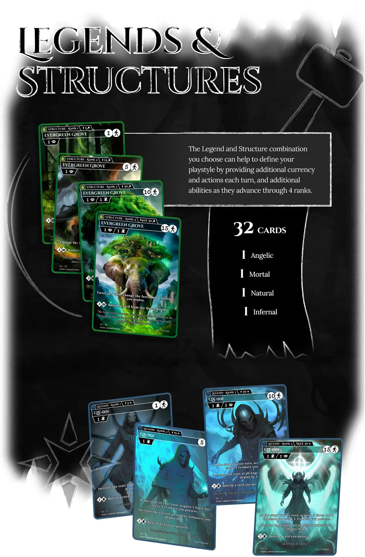
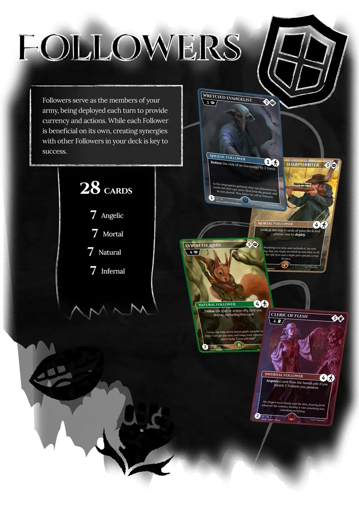
No product UI is public, so the plates show the same idea on paper. The Eternal Quest of Legends card frame is one component with four faction variants and rank 1 to 4 progressions: a faction-colored border, a type and rank bar, cost and stat badges, an ability block, a version ID with the artist credit.
Contrast in CI
Both themes are contrast-checked by a test, so a color that fails WCAG AA cannot merge. This site runs the same check on its own tokens; the systems page lets you move a hue and watch the guard.